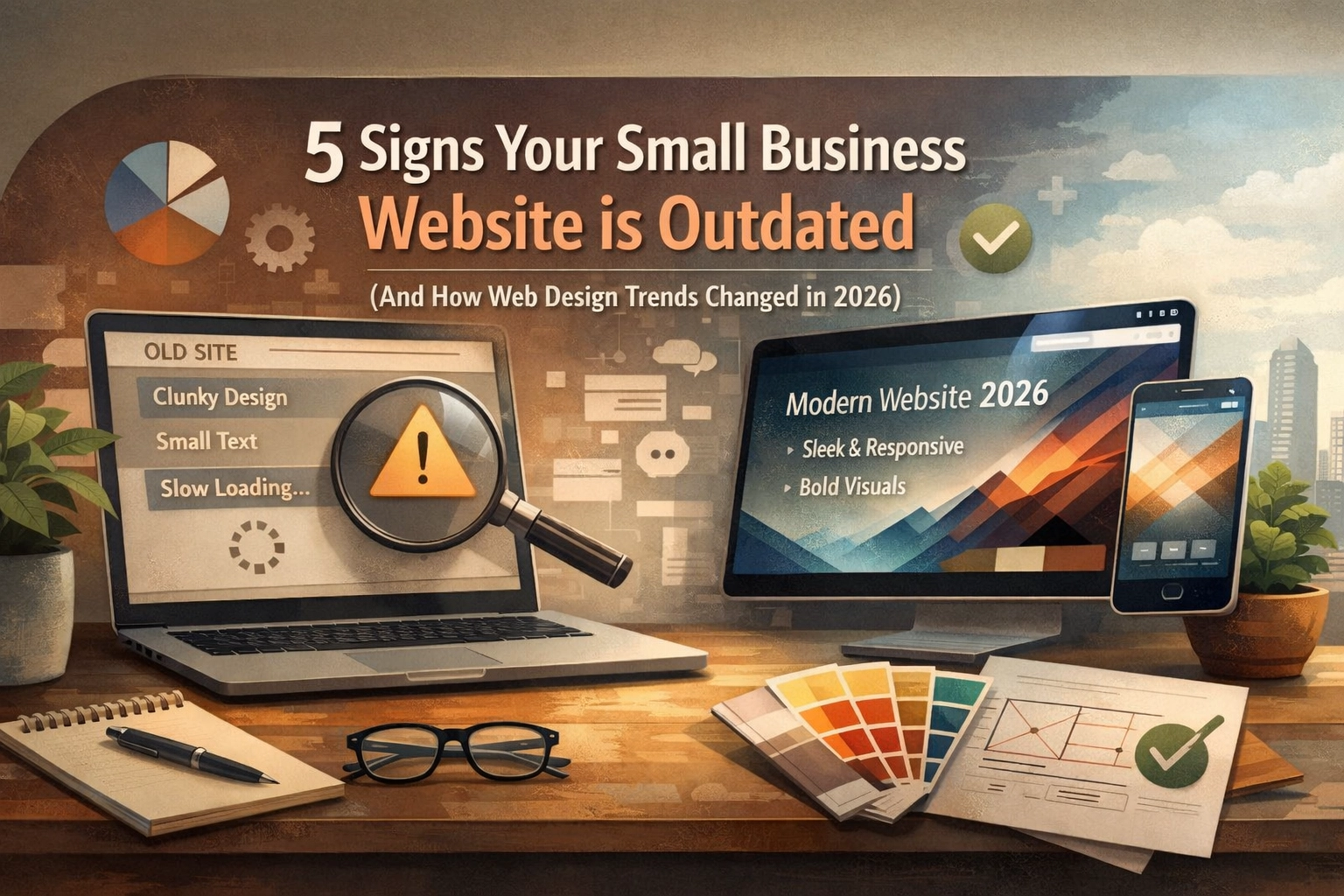
Your website doesn’t have to look bad to be outdated. It can have decent colors, a recognizable logo, and all your contact information: but if it was built three or five years ago and hasn’t evolved, there’s a good chance it’s quietly costing you customers.
Here’s the thing: web design moves fast. What felt modern in 2022 can feel neglected in 2026. And when someone lands on your site and gets that vague sense of “meh,” they don’t stick around long enough to give you the benefit of the doubt.
So how do you know if your site is falling behind? Let’s break down the telltale signs: and what’s actually changed in the world of web design that makes those old approaches feel stale.
1. Your Website Feels Like a Digital Brochure
If your homepage is mostly blocks of text with a couple of stock photos thrown in, you’re operating in 2015 mode. Modern websites don’t just inform: they engage.
Visitors spend about 15 seconds deciding whether your site is worth their time. If all they see is static information with no clear path forward, they bounce. No interaction, no personality, no reason to explore further.
Today’s sites use personalized content, interactive tools, and dynamic elements that respond to what the visitor actually needs. Think product calculators, chatbots that actually help, or content that shifts based on where someone is in their buying journey.
Your site should feel like a conversation, not a pamphlet.

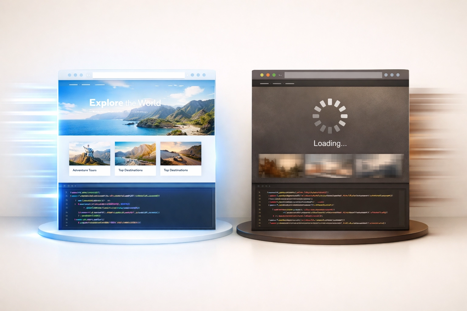
2. Your Site Takes Forever to Load
Speed isn’t optional anymore: it’s expected. If your website takes longer than 2–3 seconds to load, people are already clicking away before they even see what you do.
Slow sites happen for predictable reasons: huge unoptimized images, outdated WordPress builds, clunky themes, cheap hosting, or a graveyard of plugins you installed years ago and forgot about.
And it’s not just about user experience. Google factors page speed into rankings. A slow site doesn’t just frustrate visitors: it actively works against your visibility in search results.
If you haven’t checked your site speed lately, it’s worth running a quick test. Tools like Google PageSpeed Insights will tell you exactly what’s dragging you down. Often, the fixes are simpler than you’d think: compressing images, updating your theme, or switching to better hosting can make a massive difference.
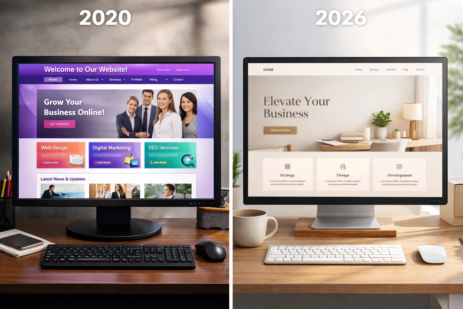
3. Your Design Screams “Different Era”
Design ages fast. What looked sharp in 2020 might now look boxy, cluttered, or just off compared to your competitors.
Here’s what signals outdated design to visitors:
- Crowded pages with too much happening at once
- Generic stock photos that look like every other business site
- Random color choices with no real system behind them
- Large blocks of text without visual breaks or hierarchy
- Boxy layouts that feel rigid and uninviting
When people see these visual cues, they make assumptions about your business: even if those assumptions aren’t fair. An outdated site suggests an outdated business. Visitors wonder if you’re still active, still relevant, or still taking things seriously.
Modern web design leans on clean layouts, bold typography, intentional color palettes, and hero sections that communicate quickly and clearly. The goal isn’t to dazzle: it’s to guide people through your site without friction.
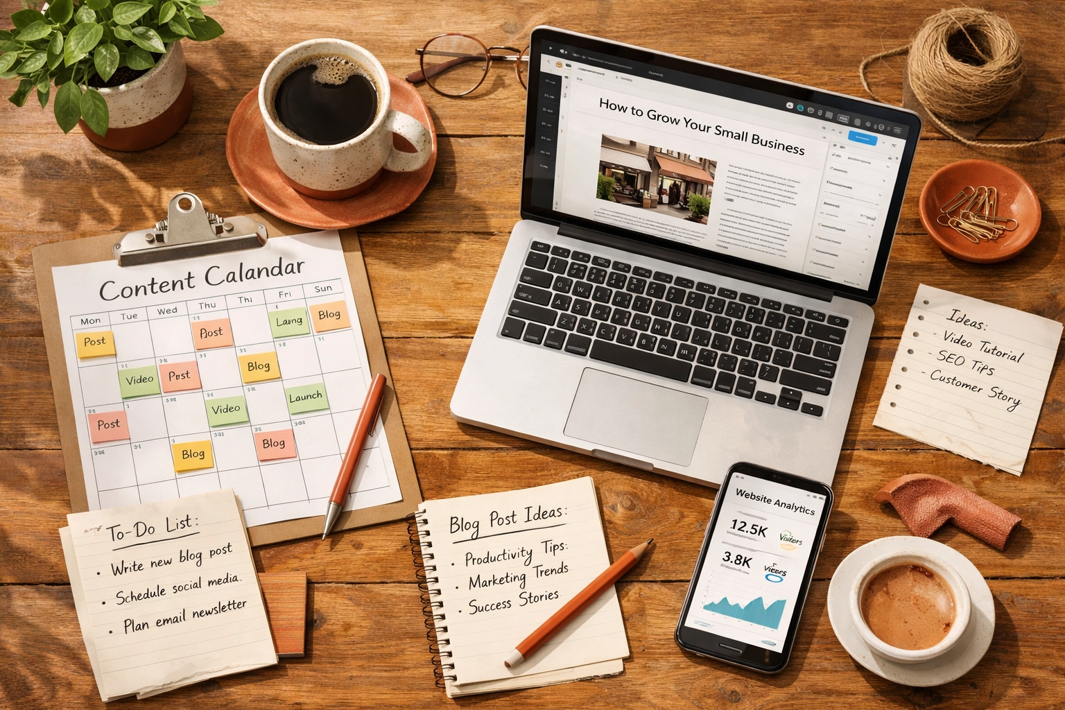
4. Your Content Hasn’t Changed in Years
If your blog’s last post is from 2022, or your service pages still reference “upcoming” events that happened three years ago, you’re sending a clear signal: We’re not paying attention.
Fresh content matters for two reasons. First, search engines prioritize sites that update regularly. If your content is stale, algorithms assume you’re less relevant than competitors who are actively publishing.
Second, visitors notice. When someone sees outdated information, they question whether your business is even still operating at full capacity. It creates doubt: and doubt kills conversions.
You don’t need to blog every week to stay current. But your site should reflect what’s happening now. Update service pages when offerings change. Add new case studies or client wins. Refresh old blog posts with current information. Even small updates signal that someone’s home.
5. Your Website Doesn’t Match Your Business Anymore
Businesses evolve. You might’ve added services, shifted your target audience, updated your branding, or changed your mission entirely. But if your website still reflects who you were instead of who you are, there’s a disconnect.
This happens more often than you’d think. A small business web design that made sense five years ago can feel misaligned once the business grows or pivots. Maybe you started as a local service and now serve clients nationally. Maybe you’ve gone upmarket. Maybe your branding got a refresh but your site still uses the old logo and colors.
When your site doesn’t match your current reality, visitors get confused. They’re not sure what you actually offer, who you serve, or whether you’re the right fit. That confusion translates into lost opportunities.
A website should feel like an accurate representation of your business right now: not a snapshot of where you were when you first launched.
How Web Design Trends Changed in 2026
The shift in web design over the past few years isn’t just about aesthetics. It’s about how people use websites, what they expect, and how technology enables better experiences.
Here’s what’s changed: and what you’ll see on sites that feel current:
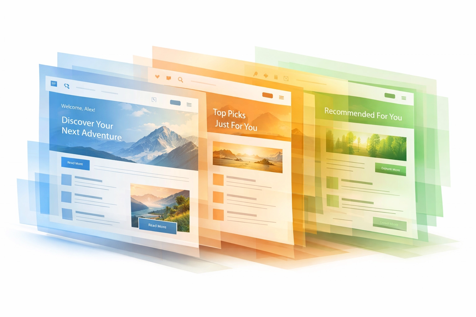
Personalization Became the Standard
Static, one-size-fits-all websites are fading out. In 2026, visitors expect content that speaks to them: whether they’re browsing for the first time or returning as a loyal customer. Sites now tailor experiences based on behavior, location, or where someone is in the buying process.
This doesn’t require complex tech anymore. Tools built into modern WordPress website design platforms make it easier to show different content to different people. Someone ready to buy sees a clear call to action. Someone still exploring sees educational content.
Speed and Performance Are Non-Negotiable
We mentioned slow load times earlier: but it’s worth emphasizing how much this has become a dealbreaker. Visitors won’t wait, and search engines won’t rank you favorably if your site drags.
Website maintenance isn’t just about fixing bugs anymore. It’s about continuously optimizing performance, cleaning up code, compressing media, and ensuring your site runs as efficiently as possible.
Accessibility Became a Requirement, Not a Bonus
Inclusive design isn’t optional anymore. Sites need to work for everyone: including people using screen readers, navigating by keyboard, or dealing with visual impairments.
This isn’t just the right thing to do (though it is). It also expands your audience and improves SEO. Search engines favor accessible sites because accessible sites tend to have cleaner code, better structure, and clearer content.
AI and Voice Search Changed How People Find You
People don’t search the way they used to. Instead of typing “web design services near me,” they’re asking Siri or Alexa full questions like “Who does affordable website redesigns for small businesses?”
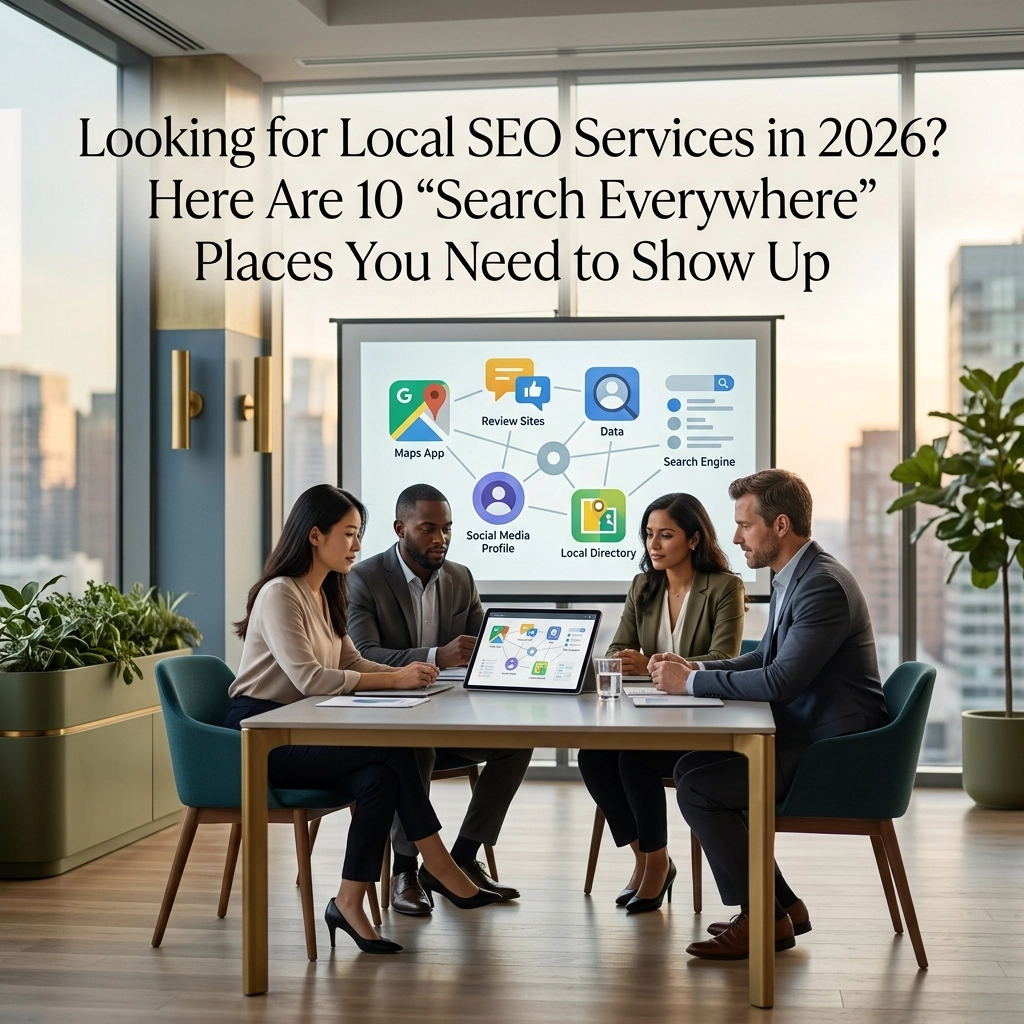
That means local SEO services and content strategies have shifted. Your site needs conversational content that answers real questions. It needs schema markup that helps AI tools understand what you offer. And it needs to be optimized for the way people actually search in 2026: not how they searched five years ago.
Conversion Paths Became More Intentional
Modern sites don’t just throw a “Contact Us” button in the header and call it a day. They map out specific paths based on what visitors need and where they are in the decision-making process.
Someone who’s ready to hire needs a fast, frictionless way to book a call or request a quote. Someone who’s still evaluating options needs content that builds trust: case studies, testimonials, educational resources.
Website redesign projects now focus heavily on conversion optimization. Every element has a purpose. Every section guides visitors toward the next logical step.
Clean, Clear Content Structure Took Over
The days of cramming everything above the fold are done. Modern sites embrace whitespace, clear hierarchy, and breathing room. They trust that visitors will scroll if the content is worth following.
This minimalist approach isn’t just aesthetic: it reduces cognitive load. When a page feels airy and organized, visitors can process information faster and make decisions more confidently.
What This Means for Your Site
If any of these signs hit close to home, you’re not alone. Most small business websites weren’t built with 2026 standards in mind: because those standards didn’t exist yet.
The good news? You don’t necessarily need to start from scratch. Sometimes a strategic refresh is enough. Update your content. Optimize your speed. Refresh your design to match current expectations. Add interactive elements that engage visitors instead of just informing them.
But if your site is really outdated: slow, misaligned with your business, or fundamentally stuck in the past: it might be time for a full website redesign. The investment pays off when your site starts working for you instead of against you.
Your website is often the first impression someone has of your business. Make sure it’s telling the right story: the one that reflects who you are today and where you’re headed tomorrow.