You know that feeling when you walk into a boutique shop where everything has its own space, the lighting is just right, and you can actually breathe? It feels intentional. It feels premium. Now, think about the last time you landed on a local business website that felt like a digital junk drawer: clashing colors, pop-ups fighting for your attention, and a navigation menu that looks like a grocery list.
It’s overwhelming, isn’t it?
In 2026, your customers are more distracted than ever. They aren’t looking for a flashy digital circus; they are looking for a clear path to the solution you provide. This is why minimalist layout ideas are no longer just for high-end fashion brands or Silicon Valley tech giants. They are the secret weapon for local brands that want to stand out by being the “quietest” room in a very loud house.
At Smallworks Web Design, we’ve seen how a clean, thoughtful website redesign can transform a struggling local page into a high-converting machine. When you strip away the fluff, your message finally has room to be heard.
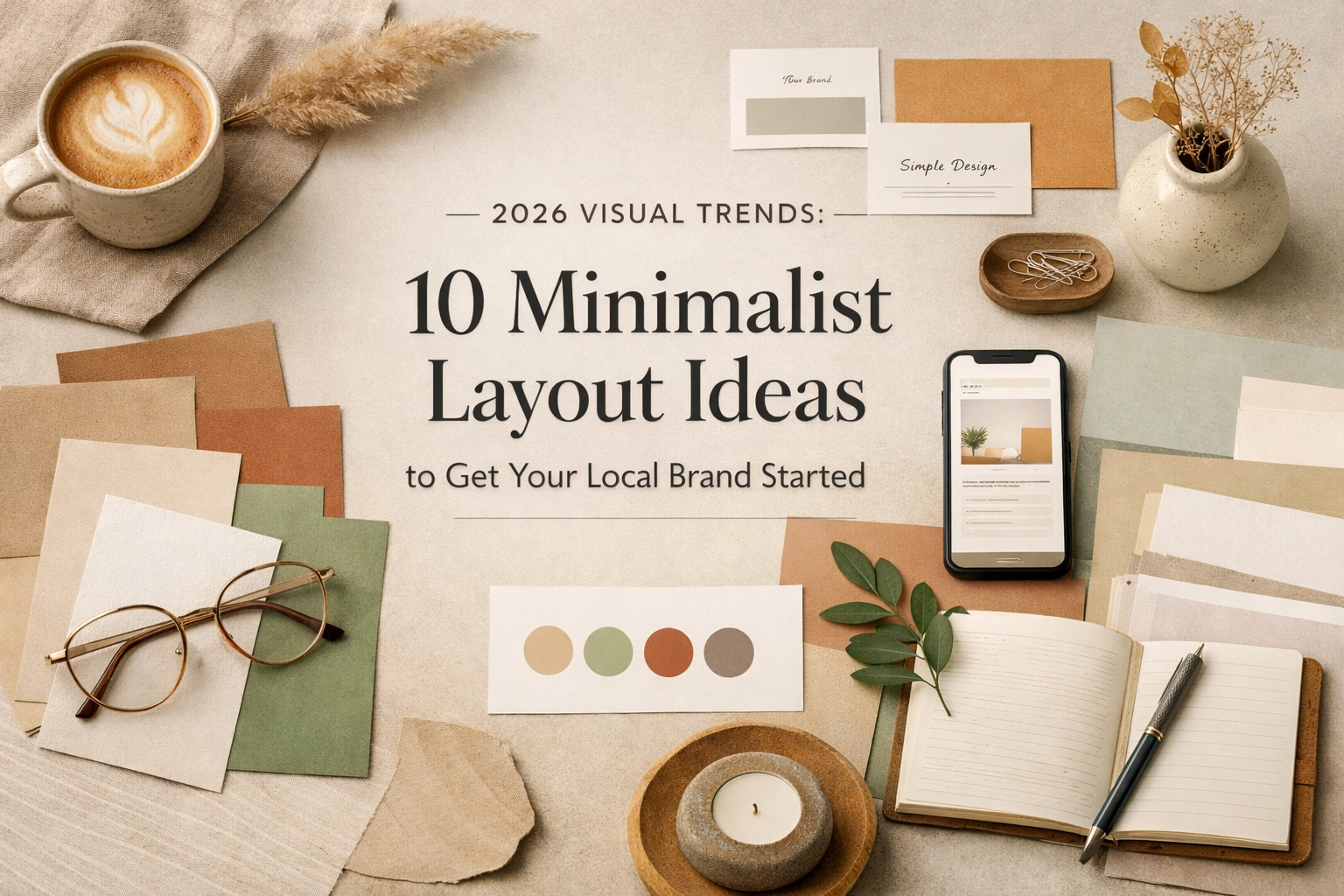
Here are 10 minimalist layout ideas trending in 2026 to help your local brand make a massive impact with less.
1. The Typographic Powerhouse
In 2026, “Bold Minimalism” is the name of the game. Instead of relying on a rotating carousel of stock photos that everyone has seen a thousand times, this layout uses massive, confident typography as the primary visual element.
Imagine a hero section where your main value proposition: something like “The Best Plumbing in Austin”: is written in a gorgeous, oversized serif font that takes up 60% of the screen. By making the text the star, you remove the distraction of unnecessary imagery and force the visitor to engage with your message immediately. It’s confident, it’s clear, and it positions you as an authority in your field.
2. The Neo-Minimalist “Airy” Grid
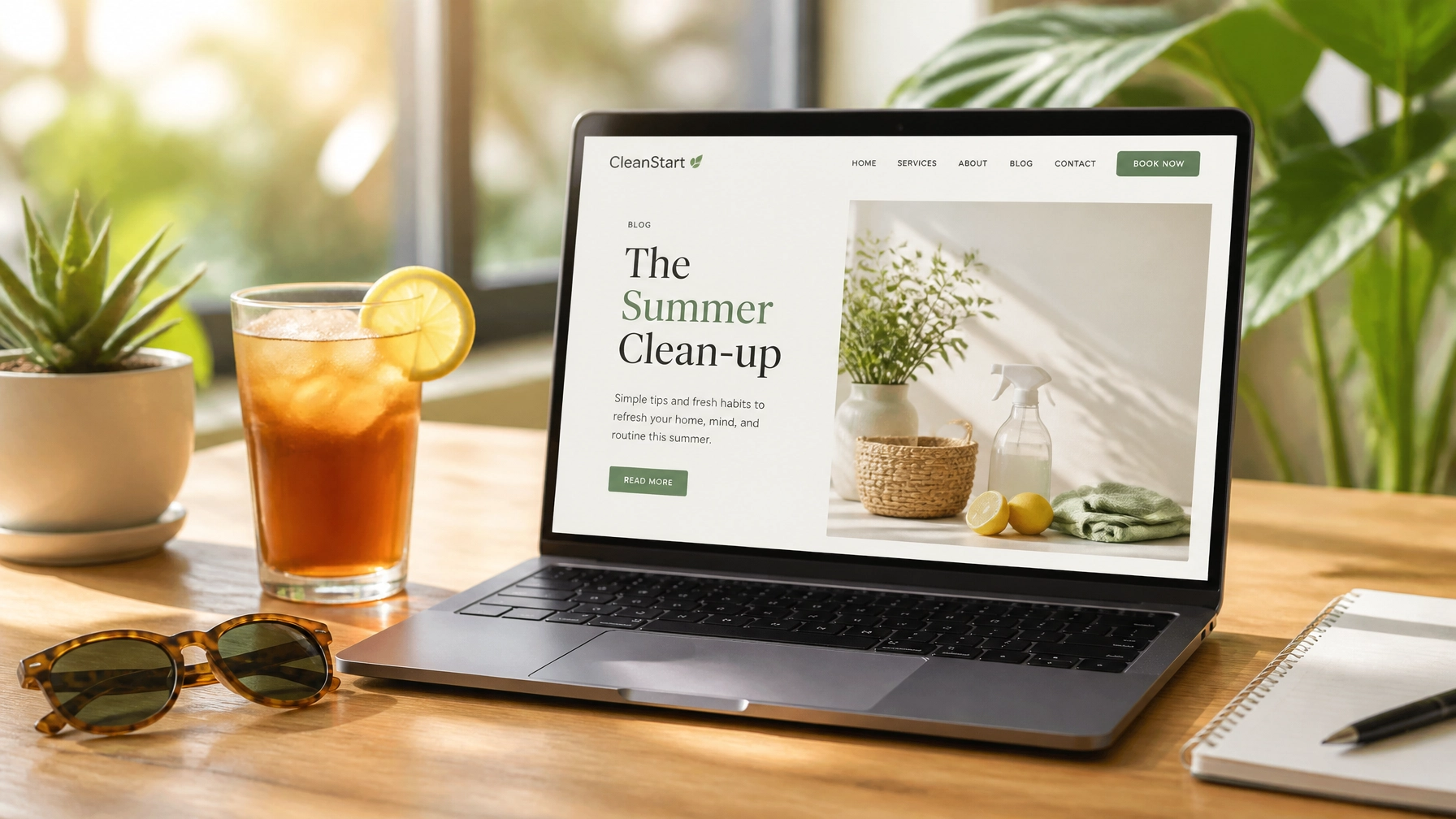
The “Neo-Minimalist” trend is all about using white space (or “negative space”) as a functional tool rather than just “empty” space. For a local service provider, this means moving away from tight, boxed-in layouts.
Instead of cramming your services into a 3-column row where everything feels squished, give each service its own “island” on the page. Use generous padding and margins to let the eye rest. When you give your content room to breathe, you signal to your customer that your business is organized and professional. It turns a standard WordPress website design into a luxury experience.
3. The Asymmetrical Split Screen
Balance doesn’t always have to mean symmetry. A popular 2026 trend for local brands is the asymmetrical split. One side of the screen (perhaps 40%) stays fixed with your primary call to action or a high-quality, natural photo of your work. The other side (60%) allows the user to scroll through your details, testimonials, and process.
This layout is perfect for small business web design because it keeps your “Book Now” or “Contact Us” button visible at all times without it feeling like a pushy pop-up. It creates a sense of depth and modern sophistication that traditional layouts just can’t match.
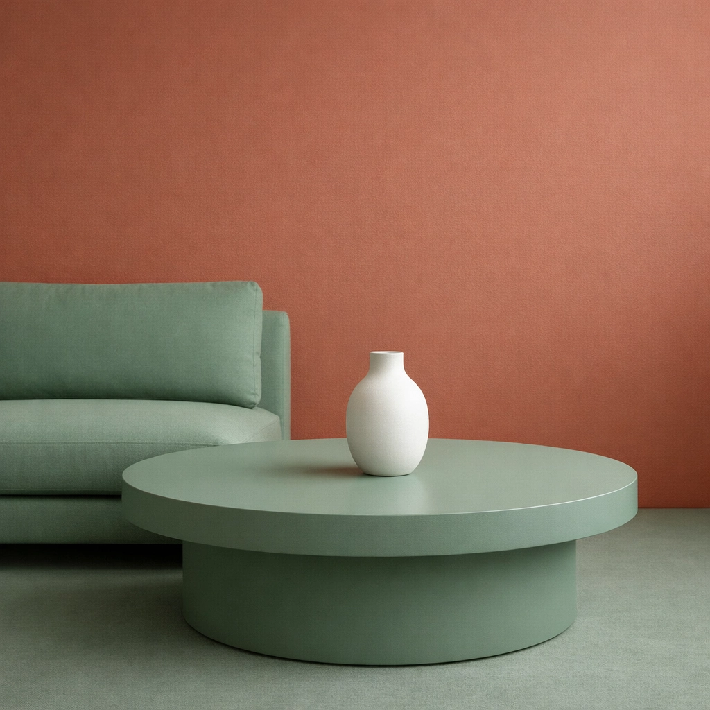
4. High-Contrast Duotone Palettes
Minimalism doesn’t mean your site has to be black and white. In 2026, we’re seeing local brands embrace high-contrast duotone palettes. Think a deep, “cool blue” paired with a soft cream or a forest green paired with a muted sand.
By limiting your palette to just two or three primary colors, you create a cohesive brand identity that is instantly recognizable. This simplicity helps with local SEO services too, as search engines favor sites with clear, accessible structures and high readability. A high-contrast design ensures that your text is easy to read for everyone, including those with visual impairments.
5. The “Text-Only” Hero Section
It takes a lot of guts to ditch the hero image entirely, but for many local businesses, it’s the most effective way to communicate. If you’re a consultant, a lawyer, or a specialized repair service, your words are often more important than a generic photo of a person smiling at a laptop.
A text-only hero section uses a beautiful background color: perhaps a subtle gradient or a textured “paper” finish: and puts your mission statement front and center. It’s a bold move that screams “we know exactly who we are.” This approach is particularly effective for website maintenance landing pages where clarity of service is the top priority.
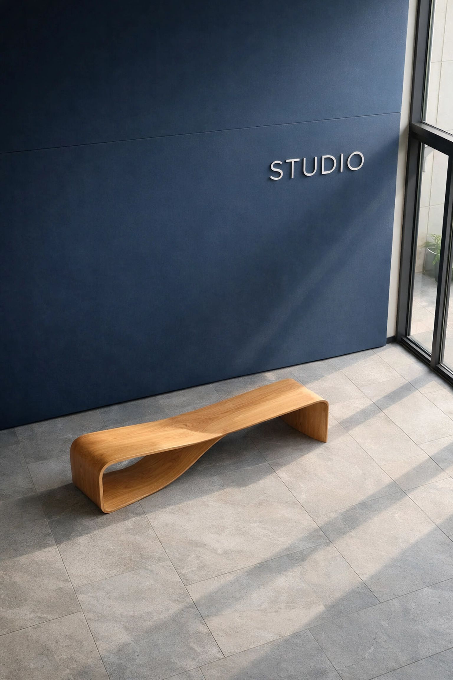
6. Layered Minimalism (Depth without Clutter)
While “flat” design was the trend for years, 2026 is seeing a return to subtle depth. We call this layered minimalism. It involves using very soft, natural shadows and overlapping elements to create a sense of three-dimensional space.
For example, you might have a high-quality photo of your local storefront with a text box slightly overlapping the corner. It feels tactile and real, almost like a physical brochure. This “neo-minimalist” touch adds a layer of quality to your web design services without making the site feel heavy or slow to load.
7. The Single-Column “Story” Layout
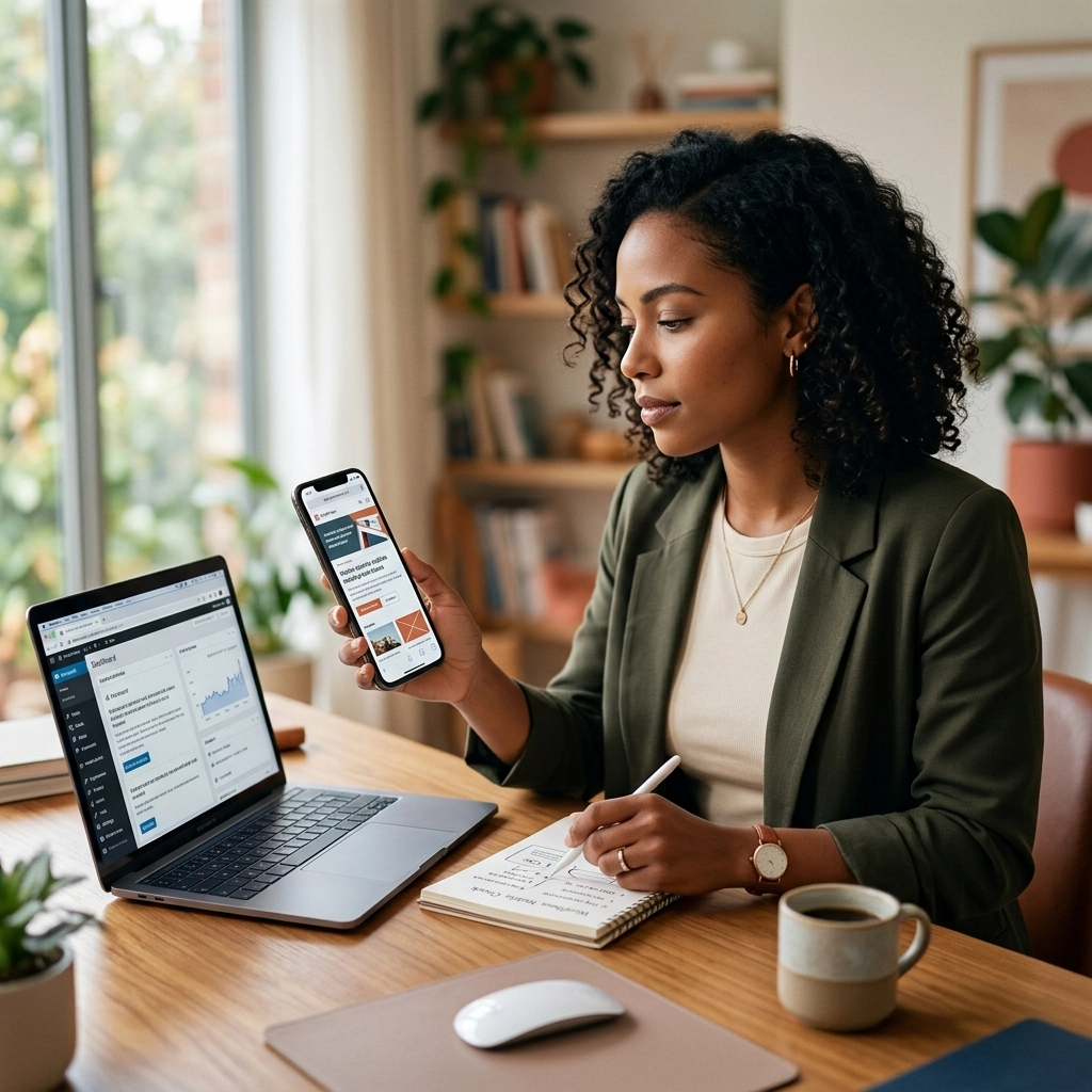
Most people are going to find your local business on their phones. Designing a layout that follows a single-column, vertical flow is a “mobile-first” dream. Instead of trying to translate complex desktop grids to a small screen, you design for the scroll.
This layout treats your website like a story. You start with the problem, move to the solution, show the proof (reviews), and end with the invitation. It’s a linear path that guides the user toward a conversion without any side-tracks or “shiny object” distractions.
8. Micro-Interactions as Navigation
Minimalism doesn’t have to be static. In 2026, we use “micro-interactions” to replace clunky buttons and bars. Imagine a menu that only appears when you hover over a small, elegant icon, or a button that subtly changes shape when you’re about to click it.
These small movements provide “feedback” to the user, making the site feel alive and responsive. For a local brand, these touches show a level of attention to detail that customers will assume extends to your actual work. It’s a subtle way to build trust before they even pick up the phone.
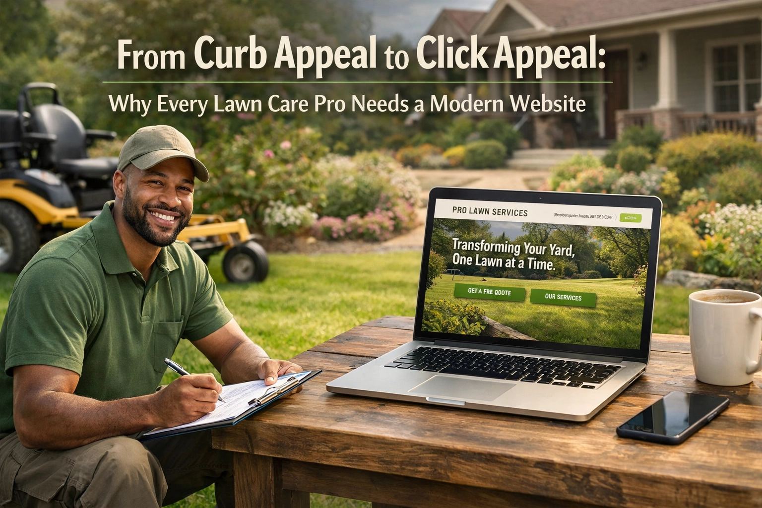
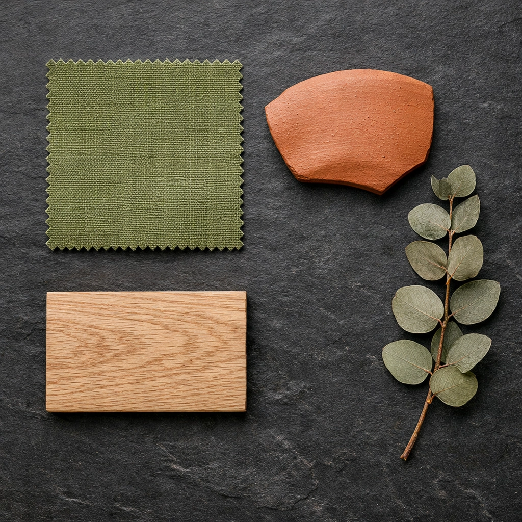
9. Natural, Minimalist Palettes (The “Earth” Vibe)
The trend for 2026 is moving away from the “techy” neons and towards a more sincere, grounded aesthetic. We’re talking about moss greens, terracotta oranges, and slate greys. Using a natural palette makes your brand feel approachable and local rather than corporate and cold.
When we handle a website redesign for a local contractor or a boutique, we often pull colors directly from their physical environment. This creates a “seamless” experience between your online presence and your real-world business.
10. The Floating “Quick-Action” Bar
In a minimalist layout, you want to hide as much of the “utility” as possible to keep the focus on the content. A floating quick-action bar is a sleek way to keep your phone number, address, and booking link accessible at the bottom of the screen without taking up a huge chunk of the header.
It stays out of the way until it’s needed. This is a game-changer for small business web design because it respects the user’s screen space while ensuring you never miss a lead.
Why Minimalism is Your Best SEO Strategy
You might be wondering, “How does a pretty layout help me show up on Google?”
It’s simpler than you think. Google’s algorithms in 2026 are heavily focused on “User Experience” (UX). A minimalist site is naturally faster because it has fewer heavy scripts and bloated images. Faster load times lead to lower bounce rates. Lower bounce rates tell Google that people like your site.
Furthermore, when you use a clean layout, your “Search Everywhere Optimization” becomes much more effective. Your keywords: like web design services or SEO services for small business: aren’t buried under a mountain of visual noise. They are easy for both humans and bots to find.
If you feel like your current site is more of a hurdle than a help, it might be time for a change. Whether you need a full website redesign or just some consistent website maintenance to clean things up, the goal is the same: clarity.
Making the Shift
Transitioning to a minimalist aesthetic doesn’t mean losing your brand’s personality. In fact, it’s about uncovering it. When you remove the distractions, the heart of your local business: your story, your quality, and your community roots: can finally shine through.
Think of your website as your digital storefront. If you wouldn’t let clutter pile up in your lobby, don’t let it pile up on your homepage.
Ready to give your local brand the professional, clean look it deserves? At Smallworks Web Design, we specialize in creating high-performing, beautiful sites for businesses just like yours. Let’s talk about how we can simplify your digital presence and amplify your results. Check out our portfolio to see these trends in action, or contact us today to get started on your 2026 refresh.
Your customers are looking for you. Make sure they can actually see you.