You have probably spent hours, maybe even days, scrolling through stock photo websites, trying to find that perfect image. You know the one: it needs to look professional, but not too corporate; friendly, but not cheesy; and it has to fit your brand perfectly. It is a common struggle for many owners looking for small business web design that actually works. We often feel this immense pressure to “wow” visitors with high-definition, flashy visuals the second they land on our page.
But what if that massive, high-resolution hero image is actually doing more harm than good?
In the fast-paced world of 2026, user attention is a currency that is harder than ever to earn. While we used to think that a big, beautiful photo was the key to a professional site, the data is starting to show a different story. For many local brands, the “flashy” approach is being replaced by something much more effective: strategic simplicity.
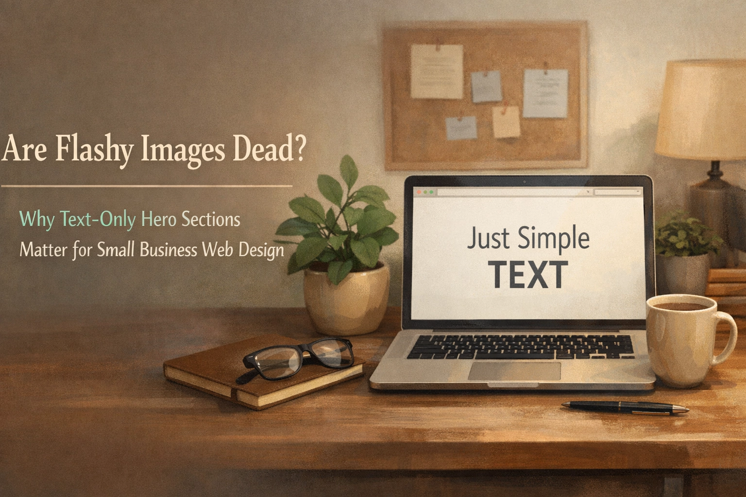
Let’s dive into why text-focused hero sections are becoming a secret weapon for modern web design services and how they can help your business stand out by saying less.
The Problem with Visual Overload
Imagine walking into a store where the front window is covered in a giant, beautiful, but slightly blurry poster of a sunset. It looks nice, sure, but you have no idea what the store actually sells. You have to walk inside and wander around just to figure out if they have what you need. Most of your website visitors won’t bother walking inside: they will just keep walking down the digital street to the next shop.
In the world of WordPress website design, we call this “visual noise.” When an image is too busy or lacks a clear connection to your service, it creates a cognitive load. Your visitor’s brain has to work harder to filter out the background to find the information they actually came for.

By stripping away the unnecessary decoration, you allow your message to breathe. You aren’t just showing them a picture; you are giving them the answer to their problem immediately.
Clarity Beats Decoration Every Single Time
The core of any successful website redesign should be clarity. According to current research, you have roughly three seconds to convince a visitor to stay on your site. If they spend those three seconds trying to figure out what that abstract background photo of a “team high-fiving” represents, you’ve already lost them.
A text-only or text-dominant hero section forces you to be precise. It forces you to answer the most important questions right away:
- What do you do?
- How does it make the customer’s life better?
- What should they do next?
When you work with professional web design services, the goal is often to hit a “comprehension target” of 6 to 10 words for the main headline. If you can’t explain your value proposition in ten words, your message might be too complicated. By removing the distraction of a flashy image, your words carry more weight. They become the hero of the page.
The Mobile-First Reality
We are living in a mobile-only world. If you look at your analytics, chances are more than half of your traffic is coming from a smartphone. This is where flashy hero images really start to struggle.
Big images take time to load. Even with the best website maintenance and optimization, a massive 4K hero image can slow down your site just enough to hurt your local SEO services rankings. Google loves speed, and so do your customers. A text-focused hero section is lightweight. It loads almost instantly, providing a seamless experience for someone browsing on a 5G connection (or a spotty LTE one).

Furthermore, what looks great on a 27-inch desktop monitor often looks cramped and messy on a 6-inch phone screen. By prioritizing a minimalist, text-first layout, you ensure that your message is legible and your Call to Action (CTA) is easy to tap, no matter what device your customer is using.
Authenticity Over Corporate Polish
There is a shift happening in how consumers view small businesses in 2026. People are tired of the “corporate polish” that feels fake or inaccessible. They want to know the people behind the brand.
A flashy, expensive-looking stock photo can actually make a small business feel less trustworthy. It can look like you are trying too hard to seem bigger than you are. On the other hand, a clean, bold, text-only section: perhaps paired with a single, high-quality, authentic photo of your real team or your real work: feels honest.
It says, “We don’t need to hide behind flashy graphics because our work speaks for itself.” This brand of “confident minimalism” is incredibly effective for small business web design. It positions you as an expert who values the customer’s time and focuses on results rather than fluff.
Boosting Your SEO and Conversion Rates
You might be wondering: “If I remove the images, will my SEO suffer?” Actually, it’s often the opposite. When you focus on clear, keyword-rich headlines, you are feeding the search engines exactly what they want.
Strategic text allows you to naturally integrate your target keywords: like web design or SEO services for small business: directly into the most important real estate on your site (the H1 tag). This creates a direct line between what people are searching for and what they see the moment they land on your page.
Beyond SEO, simplicity is a conversion driver. When there are fewer things to look at, there are fewer things to click on other than your primary button. This is the power of micro-interactions and focused design. By guiding the eye naturally from a bold headline to a clear promise, and finally to a “Get Started” button, you are creating a frictionless path to a sale.
How to Nail the Text-Only Hero Look
If you are considering a website redesign that leans into this minimalist trend, there are a few “rules of the road” to keep in mind to ensure it doesn’t just look “empty.”
- Typography is Everything: When text is the star of the show, your font choice matters. It needs to be bold, readable, and full of character.
- Embrace Whitespace: Don’t be afraid of the “empty” space around your words. Whitespace is what gives your site a premium, airy feel. It makes your content look organized and professional.
- The 3-Second Rule: Ensure your headline is scannable. Use a mix of short, declarative statements for impact and a slightly longer sub-headline for context.
- Use Strategic Contrast: Since you aren’t using images to create visual interest, use color. A bold background color with high-contrast text can be just as “flashy” as a photo, but much more functional.
Is it Time for a Change?
The “shouting into the void” method of web design: where you throw every image and graphic at the wall to see what sticks: is over. In 2026, the most successful small business websites are those that respect the user’s time and provide instant value.
If your current site feels like a cluttered attic of old stock photos and confusing messaging, it might be time to look at website design through a simpler lens. Whether you need a full overhaul or just some consistent website maintenance to trim the fat, focusing on a text-first approach can revitalize your online presence.

Think of your website as a 24/7 marketing machine. Is that machine currently a sleek, high-speed engine, or is it weighed down by heavy, unnecessary decorations?
The shift toward minimalist hero sections isn’t about being boring; it’s about being effective. It’s about making sure that when a local customer finds you, they don’t just see a pretty picture: they see a solution to their problem.
If you’re ready to clear the clutter and build a site that truly connects, check out our services or see how we handle website redesign to help small businesses like yours shine in a crowded digital world.
Sometimes, the best way to be heard is to stop shouting and start speaking clearly.