Ever tried to book a service or buy a product on your phone, only to find that the “Submit” button is hidden behind a chat bubble, or the text is so small you need a magnifying glass to read it? It’s frustrating, right? We’ve all been there, pinching, zooming, and eventually giving up to find a competitor whose site actually works.
If you’re running a business in 2026, your website isn’t just a digital brochure; it is often the very first handshake you have with a customer. And that handshake is happening on a five-inch screen. If your small business web design feels like an afterthought on mobile, you aren’t just losing clicks, you’re losing trust.
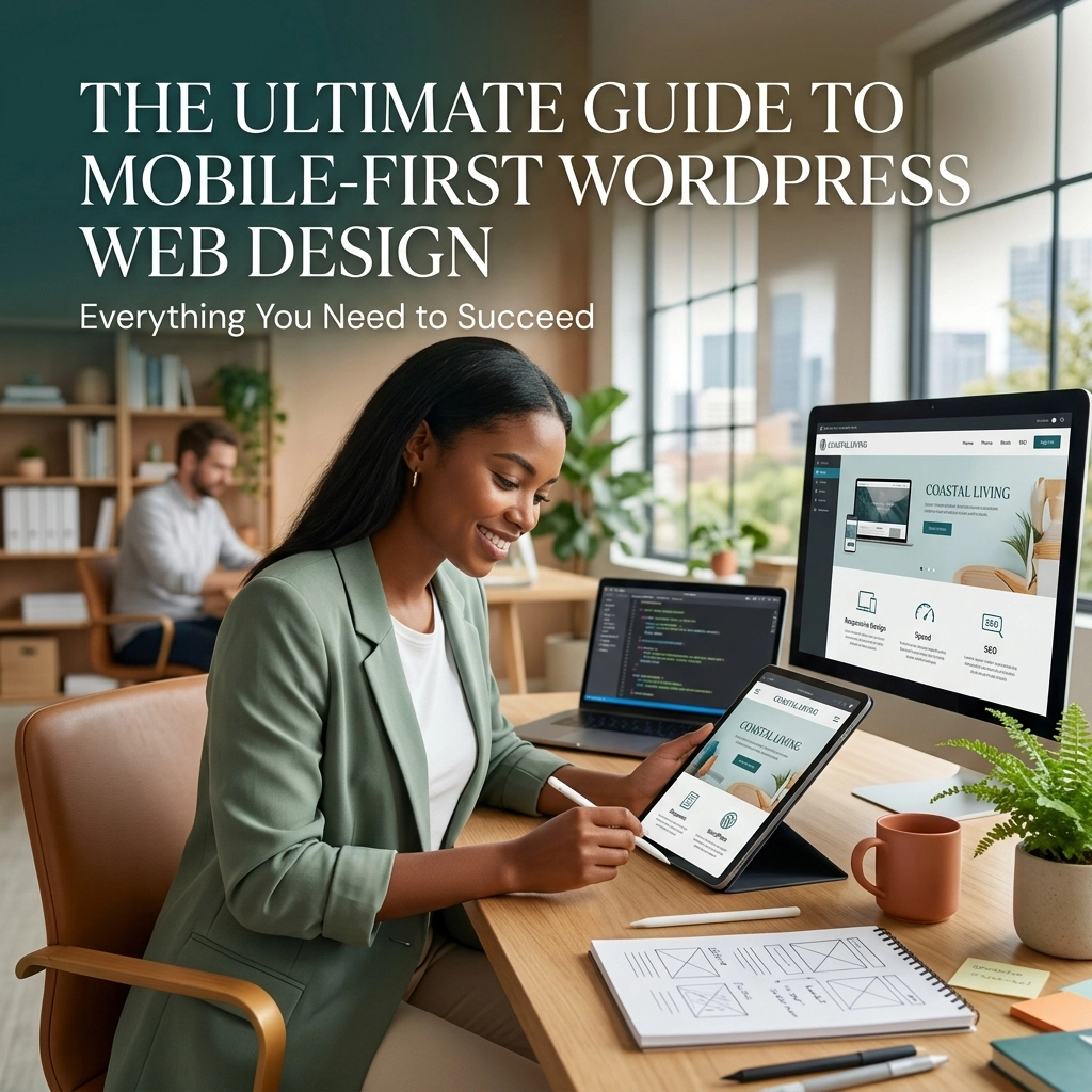
Designing for mobile first isn’t just a “nice to have” anymore. It is the foundation of modern website design. In this guide, we’re going to break down how to flip the script, prioritize the mobile experience, and ensure your WordPress site is a high-performing, lead-generating machine.
What Exactly is Mobile-First Design?
For years, the standard workflow was to design a beautiful desktop site and then “shrink” it down for phones. We called this responsive design. But mobile-first design flips that logic on its head. Instead of scaling down, we start with the smallest screen, the mobile phone, and build upward.
Think of it like building a house. You don’t build a mansion and then try to figure out how to fit a studio apartment inside it. You start with the essentials, the foundation, the plumbing, the core rooms, and then you expand as space allows. By starting with the mobile experience, you are forced to prioritize what actually matters to your user.
When you work with a WordPress website design specialist, this approach ensures that your core messaging isn’t buried under flashy desktop-only features. It forces clarity. It forces speed. And most importantly, it ensures your site is accessible to the two-thirds of web traffic that now comes from mobile devices.

Why Your Small Business Can’t Wait
You might be thinking, “My customers still use computers.” While that might be true for some, Google’s eyes are strictly on your mobile site. Google uses mobile-first indexing, meaning it looks at the mobile version of your pages to decide where you should rank in search results.
If your mobile site is slow or clunky, your SEO services for small business won’t save you. You could have the best keywords in the world, but if the user experience (UX) is poor, you’re effectively shouting into the void. A mobile-first approach directly feeds into your local SEO services, ensuring that when someone nearby searches for your business, they find a site that loads instantly and works perfectly.
Beyond the search engines, it’s about your brand’s reputation. A sleek, fast mobile site tells your customers that you are professional, modern, and attentive to their needs. A broken mobile site? It tells them you’re a bit outdated, and that’s a hard label to shake.
The Blueprint: Designing for Thumbs, Not Cursors
Designing for mobile is fundamentally different from designing for desktop because of how we interact with the screen. We don’t have a precise pixel-perfect cursor; we have thumbs.
1. The Power of Micro-interactions
In 2026, we’re seeing a massive shift toward micro-interactions. These are the tiny visual cues that happen when a user interacts with your site, a button that subtly changes shade when pressed, or a progress bar that glides as they scroll. These small touches make the site feel alive and responsive. They provide instant feedback, telling the user, “Yes, I saw that tap.”
2. Touch-Friendly Navigation
The “hamburger menu” (those three little lines) is a staple, but it’s not the only way. Consider sticky bottom navigation bars for your most important links, like “Call Now” or “Book an Appointment.” This keeps the most vital actions within easy reach of the user’s thumb, significantly boosting your conversion rates.
3. Visual Trends: Dark Mode and Minimalism
We are seeing a move toward minimalist layouts and dark mode options for local brands. Dark mode isn’t just a style choice; it’s easier on the eyes and can even save battery life on certain mobile screens. A minimalist palette, using natural tones and plenty of white space (or “breathing room”), helps your content stand out without overwhelming the viewer.

The Technical Engine: Speed and Performance
A beautiful design is useless if it takes ten seconds to load. Mobile users are notoriously impatient. If your site doesn’t load in under three seconds, they’re gone. This is where website maintenance and technical optimization become your best friends.
Performance optimization is the heartbeat of mobile-first design. Mobile devices often have less processing power and slower internet connections than desktops. To succeed, you need to:
- Compress Your Images: Large, unoptimized images are the #1 killer of mobile speed. Use modern formats like WebP to keep things crisp but lightweight.
- Use the Right Theme: Start with a lightweight WordPress theme like Astra or GeneratePress. These are built for speed and give you a clean slate to build upon.
- Leverage Gutenberg Blocks: The WordPress block editor is incredibly flexible for mobile. It allows you to stack elements vertically, ensuring your content flows naturally on a narrow screen.
If your current site feels sluggish, it might be time for a website redesign. Sometimes, trying to patch up an old, heavy site is like trying to put a new engine in a rusted-out car. A fresh, mobile-first build can often be more cost-effective in the long run.
Text-Only Hero Sections: Simple Messaging vs. Flashy Images
One of the biggest trends for 2026 is the “Text-Only Hero Section.” Traditionally, we’ve put massive, high-resolution images at the top of every homepage. On mobile, these images often take forever to load and push your actual message below the fold.
Instead, try using bold, clear typography to state exactly what you do and who you do it for. This ensures that the moment someone lands on your site, they get the information they need without waiting for a 5MB image of a sunset to download. It’s clean, it’s professional, and it’s incredibly fast.

5 Signs Your Website is Outdated (The Audit)
Not sure if you need to make the jump to a mobile-first design? Here is a quick “Fix-It” list to help you audit your current performance:
- Pinch and Zoom: If a user has to zoom in to read your text or click a button, your site is outdated.
- Slow Load Times: Use a tool like Google PageSpeed Insights. If your mobile score is in the red, you’re losing money.
- The “Fat Finger” Test: Are your buttons too close together? If you accidentally click “Cancel” when you meant “Submit,” your touch targets are too small.
- Flash or Old Plugins: If your site relies on outdated tech that doesn’t play well with modern mobile browsers, it’s time for an update.
- Broken Layouts: Do your images bleed off the side of the screen? Does the text overlap? These are signs of a site that was built for desktop and “forced” into a mobile shape.
If you’re checking more than two of these boxes, it’s time to look into small business web design services that prioritize the mobile user.
Moving Forward with Smallworks Web Design
Building a mobile-first website can feel like a daunting task, especially when you’re busy running the day-to-day operations of your business. But you don’t have to do it alone. At Smallworks Web Design, we specialize in creating friendly, high-performance WordPress sites that look stunning on every device.
Think of your website as your 24/7 marketing machine. When it’s built with a mobile-first mindset, it works tirelessly to attract, engage, and convert your local customers: whether they’re sitting at a desk or waiting in line for coffee.
If you’re ready to stop losing mobile leads and start growing your digital presence, let’s chat. Whether you need a full website redesign or just some expert website maintenance to get things up to speed, we’re here to help you navigate the ever-changing digital landscape of 2026.
Your customers are already on their phones. Isn’t it time your business was there, too? Reach out to us at our contact page and let’s build something great together.