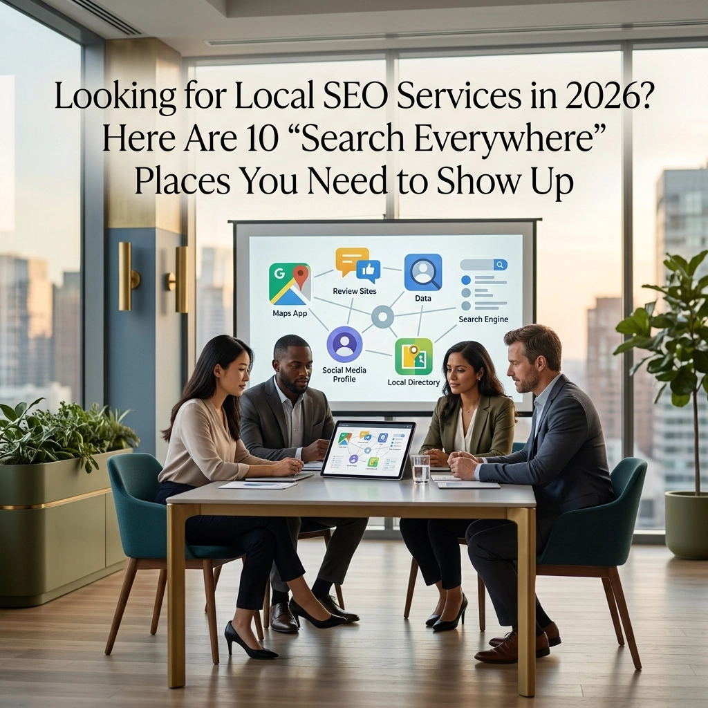
Your website might be technically functional, but does it feel modern? If you’re wondering why visitors aren’t sticking around or why your site feels a bit stale compared to competitors, the answer might not be in your content: it’s in your visual design. The trends shaping web design in 2026 aren’t just about looking good; they’re about creating experiences that feel intuitive, comfortable, and engaging.
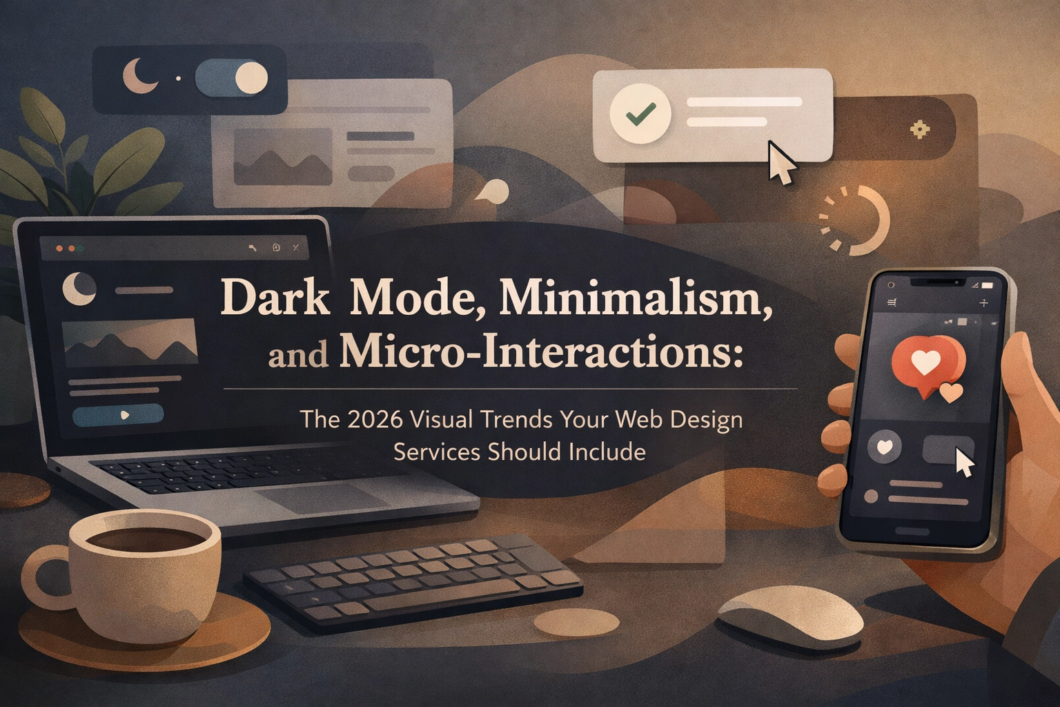
Let’s break down three visual trends that are defining exceptional web design services this year: dark mode, minimalism (with a twist), and micro-interactions. If your site isn’t incorporating at least one of these, you’re missing opportunities to connect with your audience.
Dark Mode: More Than Just a Switch
Remember when dark mode was the exciting new feature everyone talked about? Now it’s table stakes. But here’s where most small business web design gets it wrong: they treat dark mode like a simple on/off switch, slapping a black background on existing designs and calling it done.
The 2026 approach is smarter. Modern web design services build sites that dynamically adapt to user preferences: reading system settings and smoothly transitioning between light and dark themes without breaking the visual hierarchy or making text hard to read.
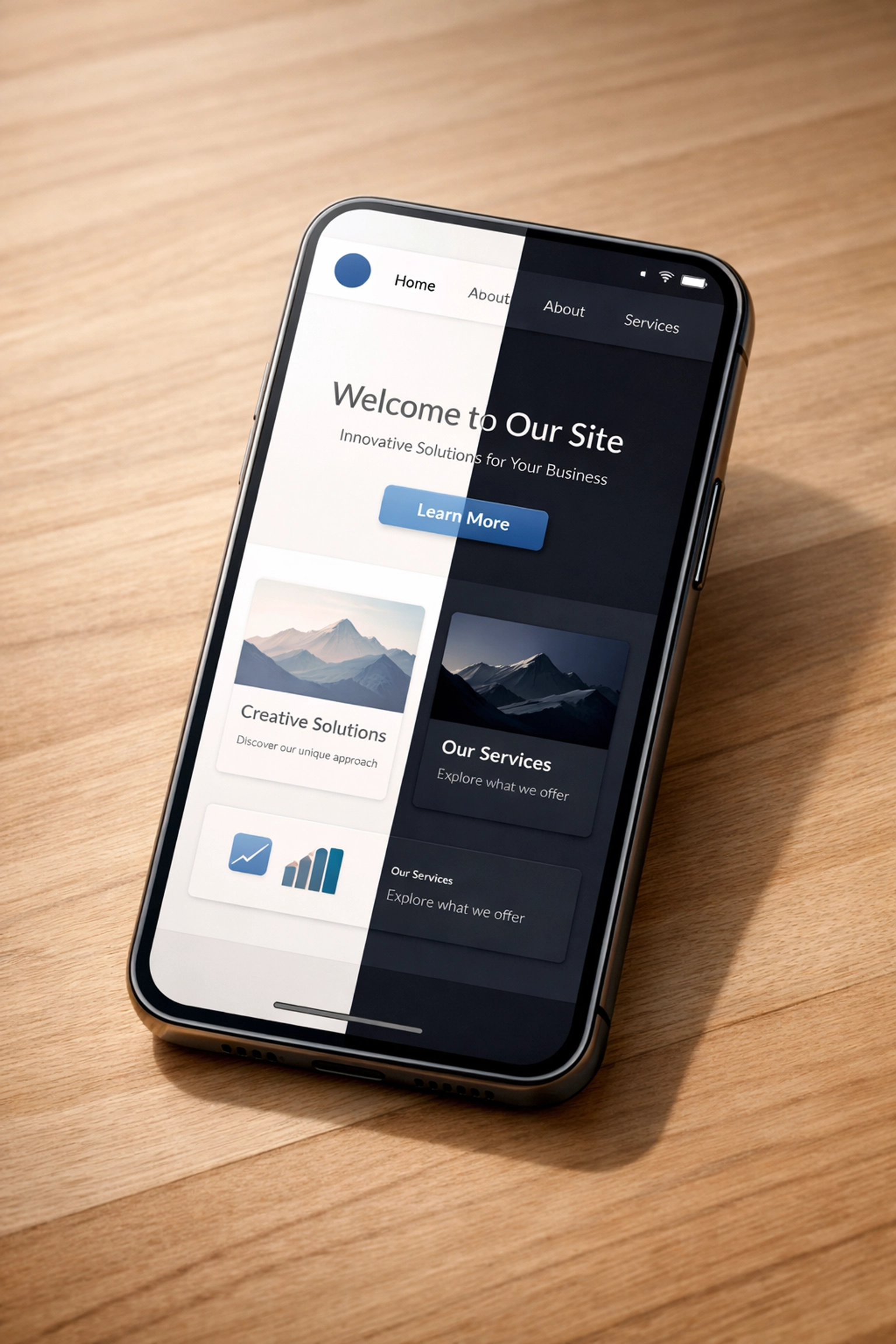
Why does this matter for your business? Because your customers are already using dark mode on their phones, tablets, and computers. When they visit your site late at night and it blasts them with a bright white background, they’re squinting and probably bouncing. Dark mode isn’t just aesthetic: it’s about respecting how people actually use the web throughout their day.
If you’re considering a website redesign, make sure your designer isn’t just offering dark mode as an add-on. It should be baked into the design system from day one, with careful attention to:
- Contrast ratios that maintain readability
- Colors that work in both modes without looking washed out or neon
- Images and graphics that adapt appropriately
- Buttons and interactive elements that remain visible and clickable
Think of it like this: you wouldn’t design a storefront that only looks good at noon. Your website should look great whether someone’s browsing during their morning coffee or their midnight scroll.
Minimalism Isn’t Going Anywhere (But It’s Getting Company)
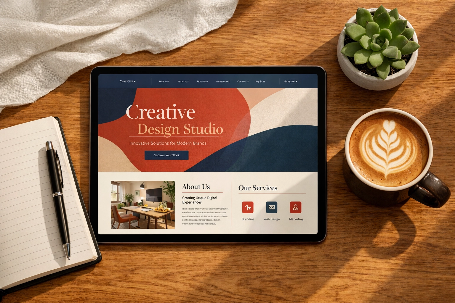
For years, minimalism ruled WordPress website design with an iron fist. Clean lines, lots of white space, simple sans-serif fonts: you know the look. And honestly? It still works beautifully when done right.
But 2026 is introducing a more nuanced conversation. Minimalism and maximalism are coexisting, and the key is knowing which approach serves your brand better.

The Minimalist Approach
If minimalism fits your brand: think professional services, wellness, consulting, or any business where trust and clarity are paramount: lean into it, but do it with intention. Modern minimalism isn’t sterile or cold. It incorporates:
- Subtle textures inspired by natural materials like paper, linen, stone, or wood grain
- Generous white space that gives content room to breathe
- Typography as a design element with careful hierarchy and spacing
- Strategic use of color rather than complete absence of it
The goal isn’t to look boring: it’s to create an environment where your message stands out clearly without visual competition.
The Maximalist Option
On the flip side, maximalism is gaining serious ground for brands that want to stand out and create memorable experiences. This isn’t about being loud for the sake of it: it’s about rich storytelling through layered visuals, bold typography, and energetic color palettes.
Brands like Spotify and Liquid Death use maximalist approaches to surprise visitors and create emotional connections. If your brand has personality, energy, and wants to make a statement, maximalism might be your answer.
The mistake? Trying to split the difference and ending up with neither. Work with web design services that understand your brand identity and can commit to an approach that actually serves your goals rather than following trends blindly.
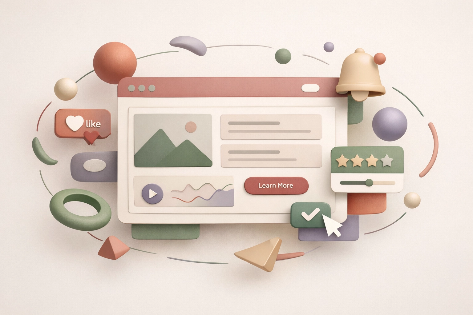
Micro-Interactions: The Details That Convert
Here’s where things get really interesting. Micro-interactions might sound technical, but they’re actually the small, delightful moments that make your website feel alive and responsive.
Think about the last time you hovered over a button and it changed color, or clicked something and saw a satisfying animation. That’s a micro-interaction: and in 2026, these tiny details are making massive differences in user engagement and conversion rates.

What Makes Micro-Interactions Work
The best micro-interactions are subtle but purposeful. They:
- Provide immediate feedback when users take action (clicked a button, filled a form, submitted information)
- Guide attention to important elements without being distracting
- Create emotional connection through playful or satisfying animations
- Reduce uncertainty by showing that something is happening (loading states, progress indicators)
For small business websites, this might look like:
- A contact button that pulses gently to draw the eye
- Form fields that highlight when focused and show a checkmark when completed correctly
- Hover effects on portfolio images that reveal project details
- Subtle scroll animations that bring content into view smoothly
- Interactive illustrations that respond to cursor movement
Animated Elements That Actually Enhance
2026 is seeing a rise in animated and interactive illustration elements that don’t just look cool: they explain complex concepts better than static images ever could. If your business involves processes, services, or technical products that are hard to visualize, animated illustrations can bridge that gap.
Even video backgrounds, when used sparingly and optimized for speed, create immersive experiences that make browsing feel more dynamic. The key word there is sparingly: you want engagement, not distraction.
The Texture Factor
One of the subtler micro-interaction trends is reactive textures: buttons that feel pressable, cards that respond to tilt on mobile devices, elements that have subtle grain or depth. These tiny visual cues make digital interfaces feel more tangible and satisfying to use.
For website maintenance purposes, these interactions need to be built efficiently so they don’t slow down your site. Work with developers who understand performance optimization alongside visual appeal.
Bringing It Together: What This Means for Your Business
So how do these trends translate into real business value? Here’s the bottom line:
Dark mode shows you respect your users’ preferences and modern browsing habits. It signals that your site was built recently and thoughtfully: not slapped together five years ago and forgotten.
Strategic minimalism or maximalism demonstrates brand clarity. You know who you are and what you stand for, and your design reflects that confidence rather than trying to please everyone.
Micro-interactions reduce friction and increase conversions. When your website feels responsive and alive, users trust it more and are more likely to complete actions: whether that’s filling out a contact form, clicking a phone number, or exploring your services.
If your current site feels dated or you’re not seeing the engagement you want, it might be time to consider a website redesign that incorporates these modern approaches.
Getting Started Without Starting Over
The good news? You don’t necessarily need to rebuild your entire site from scratch to implement these trends. Many can be incorporated through updates and refinements, especially if your site is built on a flexible platform like WordPress.
Start by auditing what you have:
- Does your site offer dark mode, and if so, does it actually work well?
- Is your visual approach: minimalist or maximalist: clearly aligned with your brand, or is it somewhere in the muddy middle?
- Are there opportunities to add subtle animations and interactions that would guide users better or make actions more satisfying?
The right web design services partner can help you prioritize which updates will make the biggest impact for your specific business and audience. Sometimes it’s about refining what you have; other times, a fresh start is the smarter investment.
Your website should feel like it belongs in 2026, not 2019. These visual trends aren’t just about keeping up with what’s cool: they’re about creating experiences that meet users where they are, respect how they browse, and make interacting with your business genuinely enjoyable.
That’s the kind of site that doesn’t just look good in a portfolio( it actually works for your business.)